
Tech
How to Spot a Potential Fraud Call: 5 Key Red Flags
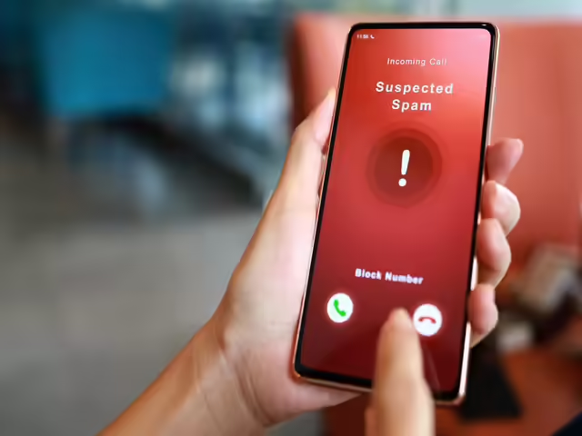
Most fraud calls do not announce themselves. They come in sounding reasonable, sometimes even familiar, and they rely on the fact that most people are not expecting to be manipulated when they pick up the phone.
The mechanics of a fraud call have gotten more refined over time. Scammers use real company names, local area codes, and personal details sourced from data breaches to make their calls feel legitimate. But no matter how polished the delivery, most fraud calls share the same structural weaknesses. Once you know what to look for, they become much easier to identify.
Five Signs a Call Is Not What It Claims to Be
Red Flag #1: The Pressure to Act Right Now
Urgency is the engine that powers almost every fraud call. The scenario changes, but the pressure does not.
It might be a supposed debt that will result in immediate arrest if not paid today. A bank account that will be frozen within the hour. A parcel that cannot be delivered without immediate identity verification. A tax filing error that requires payment before the close of business.
The artificial deadline is always the tell. Legitimate organizations, whether banks, government agencies, or service providers, do not operate by threatening immediate catastrophic consequences if you fail to act within minutes. They send written notices. They allow time to verify. They have formal processes.
A potential fraud call almost always tries to compress the decision-making window because a caller who has time to think is a caller who will research, verify, and hang up. The urgency is engineered specifically to prevent that.
If a caller tells you there is no time to verify anything, that is precisely the moment to slow down.
Red Flag #2: The Payment Method Makes No Sense for a Legitimate Request
How someone asks to be paid reveals a lot about whether the request is legitimate.
Fraud calls consistently push payment methods that are difficult to trace and impossible to reverse:
- Gift cards (iTunes, Google Play, Amazon) with instructions to read the card numbers over the phone
- Wire transfers to accounts the caller provides on the spot
- Cryptocurrency sent to a wallet address given during the call
- Peer-to-peer payment apps with instructions to mark the transaction in a specific way
No government agency accepts gift cards as payment for taxes or fines. No legitimate utility company asks for cryptocurrency. No real bank resolves fraud by having you wire money somewhere new.
The payment method request is one of the clearest markers of a potential fraud call because legitimate institutions are constrained by regulated financial systems. They cannot ask for gift cards because their processes do not accommodate them. Scammers ask for them precisely because those systems offer no consumer protection once the money moves.
- Pro tip: The moment a caller specifies gift cards, wire transfers, or crypto as the only accepted payment method, the call is a fraud call. Full stop.
Red Flag #3: They Already Know Things About You, and Use That as Proof
This one catches people off guard because it feels like the opposite of suspicious. If a caller already knows your name, your address, or even the last four digits of your account number, it seems to confirm they are who they say they are.
It does not.
Data breaches have made partial personal information widely available. Data brokers sell detailed profiles that include names, addresses, phone numbers, relatives, and purchasing history. A scammer who purchases or accesses this data can open a call sounding like they have verified your identity already, when in reality they are using that information to build your trust rather than to prove their own legitimacy.
| Legitimate Institution | Fraud Call |
| Asks you to verify your identity using their secure system | Recites your details to you as if that proves something |
| Has a case or reference number you can look up independently | Provides a callback number that routes back to the scammers |
| Encourages you to hang up and call the official number | Discourages you from ending the call or seeking verification |
| Follows a documented process you can research | Creates a unique urgent scenario with no paper trail |
Knowing something about you is not the same as being who they claim to be. The two things are completely separate, and fraud calls consistently blur that line.
Red Flag #4: The Story Starts to Crack the Moment You Ask Questions
A genuine representative from a bank, government agency, or service provider can answer straightforward questions about the situation they are calling about. They have case numbers. They can direct you to official resources. They are not rattled by someone who wants to verify.
A fraud caller is working from a script. When that script gets interrupted by unexpected questions, the response tends to go one of a few directions:
- They become more aggressive and ramp up the urgency
- They deflect and redirect back to the core pressure point
- They claim the questions themselves are causing a problem (“every minute you delay makes this worse”)
- They transfer you to a supposed “supervisor” who repeats the same script with more authority
Notice what they do not do: calmly answer your questions and give you space to verify.
Asking a caller to spell their full name, provide a direct callback number listed on the official website, and give a case reference number you can verify independently is not unreasonable. Any legitimate caller will accommodate those requests without hesitation. A fraud call will resist them, often in ways that escalate the pressure further.
Before engaging with an unknown number at all, many people simply search it first. A call number finder, a reverse number search, or even a basic web search can surface reports from others who received the same call, often saving the conversation entirely.
Red Flag #5: The Caller Tells You Not to Tell Anyone
This is one of the most psychologically specific tactics in the fraud call playbook, and it is worth paying close attention to.
Scammers frequently instruct targets not to discuss the situation with family members, friends, or bank staff. The justification shifts depending on the scenario:
- “This is an active investigation, and discussing it could compromise your case.”
- “Your bank staff may be involved in the fraud, so you cannot speak to them.”
- “This is confidential, and sharing the details could result in legal consequences.”
The secrecy instruction exists for one reason: because anyone else the target speaks to will immediately recognize the call as a scam.
Fraud calls depend on isolation. A person who is confused, pressured, and unable to consult anyone they trust is far easier to manipulate than someone who steps away from the call and asks a family member what they think.
Legitimate legal matters, tax issues, banking fraud investigations, and debt collection all have documented, verifiable processes. None of them requires the person being contacted to keep the matter confidential from their own support network.
Why Fraud Calls Keep Working on Smart, Cautious People
It is worth being direct about this: fraud calls are effective not because the targets are careless or naive, but because the tactics are designed by people who study human psychology.
Urgency overrides rational decision-making. Authority figures trigger compliance. Partial personal information creates false trust. Secrecy prevents the reality checks that would otherwise stop the scam cold.
The combination of these elements creates a situation that is genuinely difficult to navigate in real time, especially when:
- The call comes unexpectedly during a busy moment
- The scenario involves something genuinely frightening (arrest, account fraud, legal action)
- The caller sounds professional and knowledgeable
- Some of the details they provide are actually correct
Knowing these tactics exist and recognizing them by name is what gives people the ability to pause and evaluate rather than react. That pause is the most valuable tool available.
How to Respond When a Fraud Call Catches You Mid-Conversation
Identifying a potential fraud call in the moment is useful. Knowing what to do next is what actually protects you.
If something feels wrong during a call:
- Do not confirm, deny, or provide any additional personal information
- Tell the caller you will call back through official channels and hang up
- Find the official contact number independently, through the company’s website, not a number the caller provides
- Search the original number to check for fraud reports from other recipients
- Report the call to the relevant national consumer protection or telecommunications authority
Hanging up is never rude when the call is a fraudulent call. It is the right move.
If the call turned out to be legitimate, a real organization will have a record of the contact attempt, and you can follow up through verified channels without any consequence. The slight inconvenience of hanging up on a genuine call is nothing compared to the cost of staying on a fraudulent one.
5 Red Flags, Endless Scripts, One Consistent Outcome
Fraud calls are not random. They are targeted, researched, and timed to catch people at their most distracted or vulnerable. The five red flags covered here, artificial urgency, unusual payment methods, false familiarity, script rigidity, and enforced secrecy, appear across virtually every variation of phone-based fraud because they work.
Recognizing a potential fraud call is a skill, and like any skill, it gets sharper with practice and awareness. The goal is not to become suspicious of every call, but to know the difference between the pressure a legitimate organization might apply and the pressure that exists purely to manipulate.
That distinction, once clear, is hard to unsee.
Healthcare organizations face many staffing challenges, from needing to quickly fill open positions to managing constantly changing patient needs. Hospitals, clinics, and other facilities often need flexible solutions to help them maintain quality care while keeping their daily operations running smoothly. Modern staffing systems make it easier to organize schedules, connect with qualified professionals, and respond to changing workforce demands.
One solution that has become increasingly valuable is a locums VMS platform. This type of system helps healthcare organizations manage their temporary staffing needs in one central location. Instead of relying on multiple spreadsheets, emails, or separate processes, a VMS platform allows teams to track assignments, communicate with staffing partners, and keep track of important information more efficiently.
Improving Organization
Managing healthcare staffing involves many moving parts. Administrators may need to fill shifts, review credentials, approve assignments, and coordinate with staffing agencies all at the same time. A centralized staffing system brings those tasks together into a single organized platform. That reduces confusion and makes it easier for everyone involved to access the information they need. Having everything in one place can also help prevent delays and improve communication between departments.
Filling Open Positions More Efficiently
Staffing shortages can happen for many reasons, including vacations, illness, increased seasonal demand, and employee turnover. When those situations arise, healthcare organizations need to respond quickly. Modern staffing systems simplify the process of finding qualified professionals by streamlining requests and tracking available candidates. Those aspects, along with faster communication between parties, help reduce the time needed to fill open positions. That allows healthcare facilities to continue running smoothly and providing consistent patient care.
Supporting Better Decision Making
Staffing decisions depend on various factors. Healthcare leaders need to understand staffing levels, assignment histories, scheduling trends, and workforce needs before making important choices. They also need accurate, up-to-date information to help them make the best possible decisions.
Many modern staffing platforms include reporting tools that provide valuable insights. Those reports help organizations identify patterns, monitor staffing performance, and plan for future workforce requirements. Better information allows managers to make more informed decisions that support both patient care and operational efficiency.
Improving Compliance
Healthcare staffing requires careful attention to licenses, certifications, and other credentialing requirements. Keeping track of those documents manually can be time consuming. It may increase the risks of missing important deadlines and leave facilities facing serious repercussions for violating compliance regulations.
A modern staffing system can help organize credential information and provide reminders when updates are needed. That supports compliance while reducing administrative work for staffing teams. By keeping important records organized, healthcare organizations can ensure their locum tenens providers meet applicable standards before beginning new assignments.
Creating a Better Experience for Everyone
A well-designed staffing system benefits more than administrators. Healthcare professionals also appreciate the clear communication, organized scheduling, straightforward assignment management, and other benefits these solutions offer. When staffing processes run smoothly, providers can spend less time dealing with paperwork and more time focusing on patient care.
Staffing agencies and healthcare organizations also benefit from improved collaboration through shared information and simplified workflows. Agencies are better able to match candidates with the facilities that need them, and medical facilities are better equipped to communicate their needs to their staffing partners. Those factors can help create stronger working relationships for everyone involved.
Staffing Systems for Today’s Healthcare Needs
Modern healthcare organizations need staffing solutions that are flexible, organized, and easy to manage. Smarter staffing systems simplify scheduling, improve communication, support compliance, and provide valuable insights for future planning. By using technology to streamline workforce management, healthcare facilities can respond more effectively to changing staffing needs while maintaining their focus on delivering high-quality patient care.

With the increasing competition across digital channels, creating qualified leads has become more difficult. Email inboxes get clogged up pretty fast, online ads tend to get overlooked, and many prospects are receiving hundreds of marketing messages daily.
This is why businesses are seeking methods to connect with their target audience on a more direct and impactful level. For this reason, physical mail has made a comeback since it provides a real-life experience that is difficult for digital marketing to duplicate.
Direct mail can be a powerful lead gen tool when you combine that with accurate targeting, personalization and a data-driven strategy. This is where NextPage can help businesses be different.
With advanced printing, marketing, and end-to-end campaign management, NextPage helps businesses transform direct mail into a quantifiable new opportunity source. Let’s take a look at what this process is and why it keeps working so well.
1. Combines Printing And Marketing Expertise

Many companies still view printing and marketing as two different things. This frequently leads to loose ends in the execution and effectiveness of campaigns.
NextPage does it differently with direct mail printing—production, mailing and marketing strategy all in one house. This cohesive model assists business organizations to develop campaigns that are not just professionally printed but also crafted to elicit responses.
NextPage takes care of everything from design preparation to printing, mailing, fulfillment, delivery, and reporting. This streamlined workflow minimizes errors and boosts campaign consistency.
Companies can avoid the need to coordinate multiple vendors by having one experienced partner throughout the campaign lifecycle.
2. Personalized Mail Fosters Engagement
It is extremely difficult to get people to pay attention to a generic marketing message. Communication that is relevant to their needs is more likely to get prospects to respond.
NextPage’s personalization and variable data printing features enable businesses to communicate more effectively with targeted audiences. Personalized postcards, letters, offers, and customer promotional material can feature customer names, unique offers, customized messaging, and location-specific information.
For instance, a financial services firm might have a different message for new homeowners, retirees and small business owners. Audiences are provided with content that matches their interests and needs. This degree of relevance can boost engagement and drive higher-quality leads.
3. Lead Quality Is Improved by Data-Driven Targeting
If you can’t reach the right audience, you can’t have a successful lead generation. Spending time and money sending thousands of mail pieces to recipients who are not the right ones is wasteful.
NextPage is a company that concentrates on finding and targeting more receptive audiences. Data-driven marketing solutions, audience targeting, predictive analytics, and integrated campaign strategies can be implemented to enhance the quality of outreach efforts.
This is particularly effective for sectors like healthcare, financial, insurance, and nonprofit, in which relevance for the audience is key. NextPage understands how to help these industries with specialized communication plans. More precise targeting can result in a higher response rate and more impactful conversations with prospects.
4. End-To-End Campaign Management Simplifies Execution

There are lots of moving pieces involved in managing a direct mail campaign. There are so many factors involved in design, printing, mailing, postal regulations, tracking and reporting to be considered.
NextPage makes this easy by taking care of every aspect of campaign execution. The company handles everything from getting the project in the planning phase and the preparation of designs, to the printing, sorting of the mail, delivery, fulfillment, and even the analytics.
It has its own manufacturing facility, which also contributes to the accuracy of quality control and schedule. Businesses can concentrate on lead follow-up and sales, while NextPage takes care of production and distribution. This streamlined process enables businesses to deploy campaigns more quickly and confidently.
5. High-Quality Print Helps Brands Get Noticed
Lead generation begins with capturing attention. A poorly designed or low-quality mail piece can easily be discarded. High-quality print materials create a stronger first impression and help reinforce brand credibility.
NextPage specializes in producing postcards, letters, self-mailers, custom inserts, dimensional mail pieces, and other formats designed to stand out in the mailbox. The company emphasizes print quality, color accuracy, durability, and professional presentation.
For example, a healthcare provider launching a patient acquisition campaign can use professionally printed materials that communicate trust and professionalism from the first interaction.
When recipients perceive value in the communication, they are more likely to engage with the offer. Premium finishes, strategic layouts, and compelling visuals further increase response.
6. Multi-Channel Campaigns Generate Better Results
Direct mail works even better when combined with digital marketing. Many companies use direct mail as one component of a broader lead generation strategy. NextPage supports integrated marketing approaches that connect physical mail with digital channels, helping businesses create multiple touchpoints throughout the customer journey.
For example, a prospect may receive a personalized postcard, visit a landing page, see follow-up digital ads, and then receive another targeted communication. Each interaction reinforces the message and increases the likelihood of conversion.
This coordinated approach helps businesses stay visible without overwhelming potential customers. The result is often a more effective and measurable lead generation process. Consistent messaging across channels strengthens recognition and boosts conversions.
7. Tracking And Analytics Support Continuous Improvement

Generating leads is only part of the equation. Companies also need visibility into campaign performance.
NextPage provides reporting and analytics that help organizations understand deliverability, responses, and campaign effectiveness. By reviewing campaign data, businesses can identify what worked, what needs improvement, and where future opportunities exist.
For instance, if a particular offer generates stronger response rates among a specific audience segment, future campaigns can be optimized around those insights.
This continuous improvement process helps companies make smarter marketing decisions and maximize return on investment over time. Data-driven refinement is one reason direct mail remains a valuable channel for modern lead generation. Performance insights help marketers allocate budgets more effectively over time.
Bringing it All Together
Generating leads requires more than simply sending marketing messages. Success depends on reaching the right audience, delivering relevant content, maintaining consistent quality, and measuring results.
NextPage helps businesses achieve these goals through integrated direct mail printing, personalization, targeting, production management, and campaign analytics. By managing the entire process from strategy to delivery, NextPage makes it easier for organizations to create direct mail campaigns that attract attention and encourage action.
Whether you are looking to improve lead quality, increase engagement, or strengthen marketing performance, a well-executed direct mail strategy can be an effective addition to your growth plan. The next step is evaluating how direct mail can support your lead generation goals.
Empowering local residents with fundamental lifesaving skills creates a massive safety net within any major city. When more individuals are trained to handle sudden medical emergencies confidently, overall community resilience grows and survival rates for out-of-hospital accidents rise significantly.
Why Is Local Preparedness So Crucial?
Living in a massive, sprawling city means dealing with heavy daily traffic and unpredictable delays. Even with the best emergency services in the world, an ambulance might take ten or fifteen minutes to navigate through gridlock during rush hour. Enrolling in a reliable first aid course in Los Angeles ensures you know exactly how to manage that terrifying waiting period.
Whether you are at a local farmer’s market, enjoying the beach, or just hanging out in your neighborhood, accidents happen when least expected. When ordinary citizens know how to stop severe bleeding or perform chest compressions, they actively save lives. It turns regular bystanders into crucial links in the survival chain.
How Has First Aid Training Evolved Over Time?
Forget the old days of staring at a dusty chalkboard for an entire weekend. Emergency education has evolved dramatically to match our busy, modern lives. The American Heart Association (AHA) and other top-tier providers now utilize advanced blended learning platforms.
You read the textbook materials and watch high-quality instructional videos on your phone, laptop, or tablet. Once you master the core theory at your own pace, you simply book a short, practical session with a live instructor. You go in, practice your physical compressions, get immediate feedback, and walk out fully certified.
Who Benefits The Most From This Training?
Honestly, everyone should know the basics of emergency care. However, it is especially vital for specific groups of people who interact with vulnerable populations daily.
- New parents and nannies: To learn crucial infant CPR and choking protocols.
- Fitness coaches and personal trainers: To manage gym-related injuries and sudden cardiac events.
- Community volunteers: To ensure crowd safety at local outdoor events and street festivals.
The more people we train across different neighborhoods, the safer our public spaces become. It is a shared community responsibility that genuinely brings people together and builds an environment focused on mutual protection.
Why Is Confidence Just As Important As Knowledge?
Knowing what to do in theory is only half the battle. When a real crisis occurs, fear can paralyze even the smartest individuals. That is why modern practical sessions focus so heavily on building confidence through repetitive physical practice.
By pushing on a mannequin and using a trainer AED multiple times, your body learns the physical rhythm of saving a life. This hands-on practice removes the fear of doing something wrong. It replaces hesitation with immediate, decisive action when an emergency strikes close to home.
If you are looking for first aid training near University Park, South Union Avenue, or other areas close to our facility, then you may reach out to Coast2Coast First Aid/CPR – Los Angeles in that area. For more info and articles like this visit: https://www.c2cfirstaidaquatics.com/
Frequently Asked Questions
Is the AHA certification widely accepted for employment?
Yes, American Heart Association certifications are the absolute gold standard and are universally accepted by hospitals, schools, and private businesses nationwide.
Do I need a medical background to take a community class?
Not at all. Basic community courses are designed specifically for the general public and require zero prior medical knowledge or experience.
What is the main difference between BLS and standard CPR?
Basic Life Support (BLS) is an advanced course tailored specifically for healthcare professionals, while standard CPR is geared towards everyday workplace responders.
At what age can a teenager get certified?
Most providers welcome teenagers, provided they have the physical strength to perform chest compressions adequately (usually around 12 to 14 years old).
Will I learn how to use a medical tourniquet?
Yes, modern community training usually includes basic severe bleeding control, which covers the proper application of tourniquets and wound packing techniques.

Metal Storage Sheds: A Buyer’s Guide to Steel Outbuildings for American Homes
Smarter Staffing Systems for Modern Healthcare Organizations

How Nextpage Helps Companies Generate Leads With Direct Mail Printing

Carolin Bacic: Life, Biography, Family, and Legacy

Christine Williamson: A Rising Star in Sports Journalism

Dani Daniels: A Complete Biography of the Artist, Media Personality, and Entrepreneur
-
 Celebrity10 months ago
Carolin Bacic: Life, Biography, Family, and Legacy
-
 Celebrity1 year ago
Christine Williamson: A Rising Star in Sports Journalism
-
 Celebrity9 months ago
Dani Daniels: A Complete Biography of the Artist, Media Personality, and Entrepreneur
-

 Celebrity4 months ago
Alex Eala: Rising Tennis Star from the Philippines and Her Journey to Global Success
-

 Celebrity3 months ago
Valerie Perrine: A Complete Biography of the Acclaimed Actress and Icon
-

 Celebrity8 months ago
Eleonora Incardona: Biography, Career, Age, Boyfriend, Net Worth & Lifestyle (2025)
-

 Celebrity1 year ago
Vera Davich: Biography, Life, and Legacy2025
-

 Celebrity8 months ago
Ari Kytsya: Biography, Career, Age, Lifestyle & Rise as a Global Social Media Star